Building responsive websites means using fluid layouts and flexible designs to accommodate any size screen. Part of what makes responsive design more difficult than building just a fixed, desktop-friendly website is the lack of good mockup tools. Starting your mockups in apps like Photoshop means starting with a fixed-size layout and that's not what responsive design is really about.
Designer favorites like Photoshop or GIMP can still be useful tools, but less so at the beginning of the design process. Lately we've been going old school – sketching in notebooks to outline basic layouts – and then jumping right into the HTML and CSS for actual mockups.
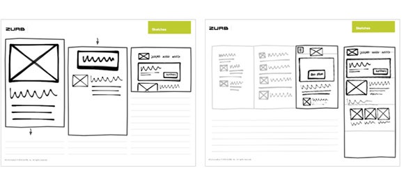
The only problem with pen and paper is that it's a pain to draw out viewport sizes for showing how your design will reflow. That's why we like Zurb's new responsive sketchsheets. The sketchsheets are just that – templates for sketching out layouts. We suggest taking a mobile first approach, for which Zurb recommends starting with the full-size mobile sheets. Also very handy are the sheets for visualizing off-canvas content on small screens.
To give them a try, head over to Zurb's playground and download the new responsive sketchsheets (which also include some older sketchsheets not geared toward responsive design) and start sketching out your ideas.